
Sheer Whiplash Valleyball
Crafting a bold, cohesive identity that captures a team’s energy and presence.
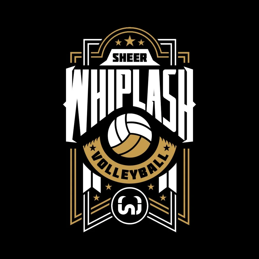
The Sheer Whiplash project was an exercise in creating a bold, unified brand identity that captured the high energy and long-standing camaraderie of a volleyball team with over a decade of history. My role encompassed the full creative process from concept development to execution, ensuring the brand identity reflected both the grit and the personality of the team. At the center of this identity was the primary logo, designed by merging the initials S and W into a single cohesive mark that could function as both a strong emblem and a versatile design element across different applications.
The project went beyond logo creation, extending into apparel design that would give the team a powerful presence both on and off the court. Two distinct shirt styles were developed, each combining the logo with an array of custom illustrations, typography, and graphic motifs to reflect the team’s character and spirit.

One design leaned into a pattern-based system with playful, edgy visuals and secondary marks, while the other emphasized a clean, badge-like composition that conveyed strength and professionalism. Together, these approaches gave the team a flexible wardrobe that balanced personality with athletic prestige.
Every element was carefully considered to ensure that the brand not only looked cohesive but also resonated with the culture of Sheer Whiplash. The visual system reinforced their identity as a competitive yet fun-spirited team, using bold type treatments, energetic graphics, and colorways that were adaptable across multiple shirt designs. The result was a complete identity package that elevated the team’s presence, celebrated their history, and gave them a memorable look that stands out in the world of recreational sports branding.

