Home Depot Annual Report Redesign.
The Home Depot Annual Report project was a complete reinvention of a traditionally dry corporate document into a visually engaging, brand-driven publication. The goal was to retain the integrity of the original content while transforming the layout and storytelling approach to better reflect the company’s bold identity and hands-on culture.


The design direction treated the report as a “blueprint for success,” combining clean typographic hierarchy with construction-inspired visuals that aligned perfectly with the Home Depot brand. Each spread was crafted to balance clarity and creativity, using tools and materials as design motifs that connected readers to the company’s core business in home improvement.


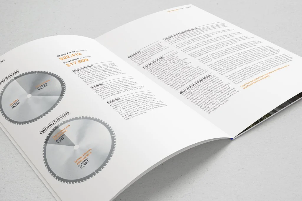
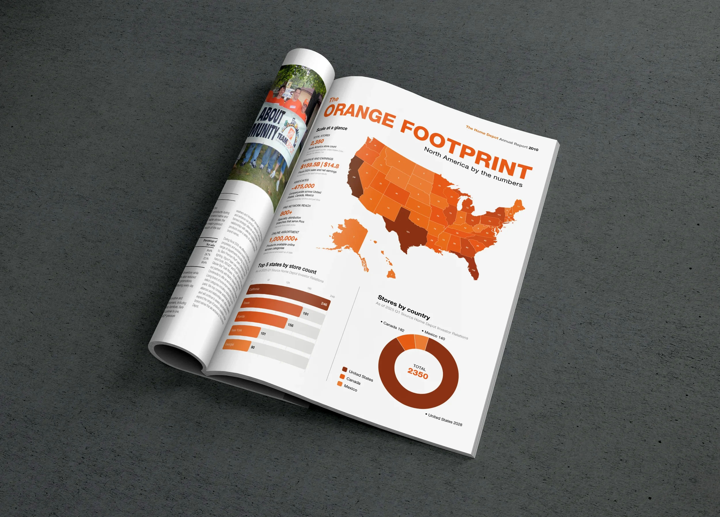
Visual metaphors like blueprints, tape measures, and saw blades were used to turn data into dynamic infographics and highlight key performance insights. The signature orange color palette anchored the design, while thoughtful use of photography, white space, and grid alignment created a sense of precision and craftsmanship.
By blending visual storytelling with professional structure, the redesigned report achieved what most corporate publications fail to do: engage. It transformed complex financial information into an approachable, visually coherent narrative that celebrates both Home Depot’s performance and its enduring brand strength.
Building a Better Report for The Home Depot.

