Forever Family Dental Branding
The Forever Family Dental branding project was developed to capture the essence of a modern dental practice built on trust, care, and long-term relationships. The goal was to design a logo that felt professional yet warm, reflecting a family-oriented approach while maintaining a clean, contemporary aesthetic. The identity needed to feel approachable to patients of all ages while standing out in a competitive suburban market.

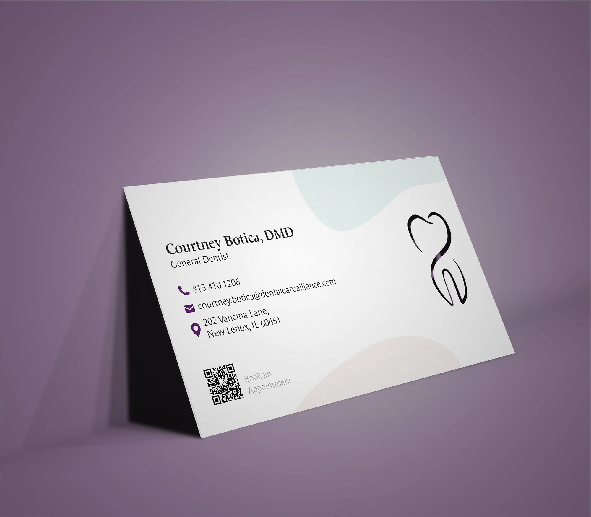
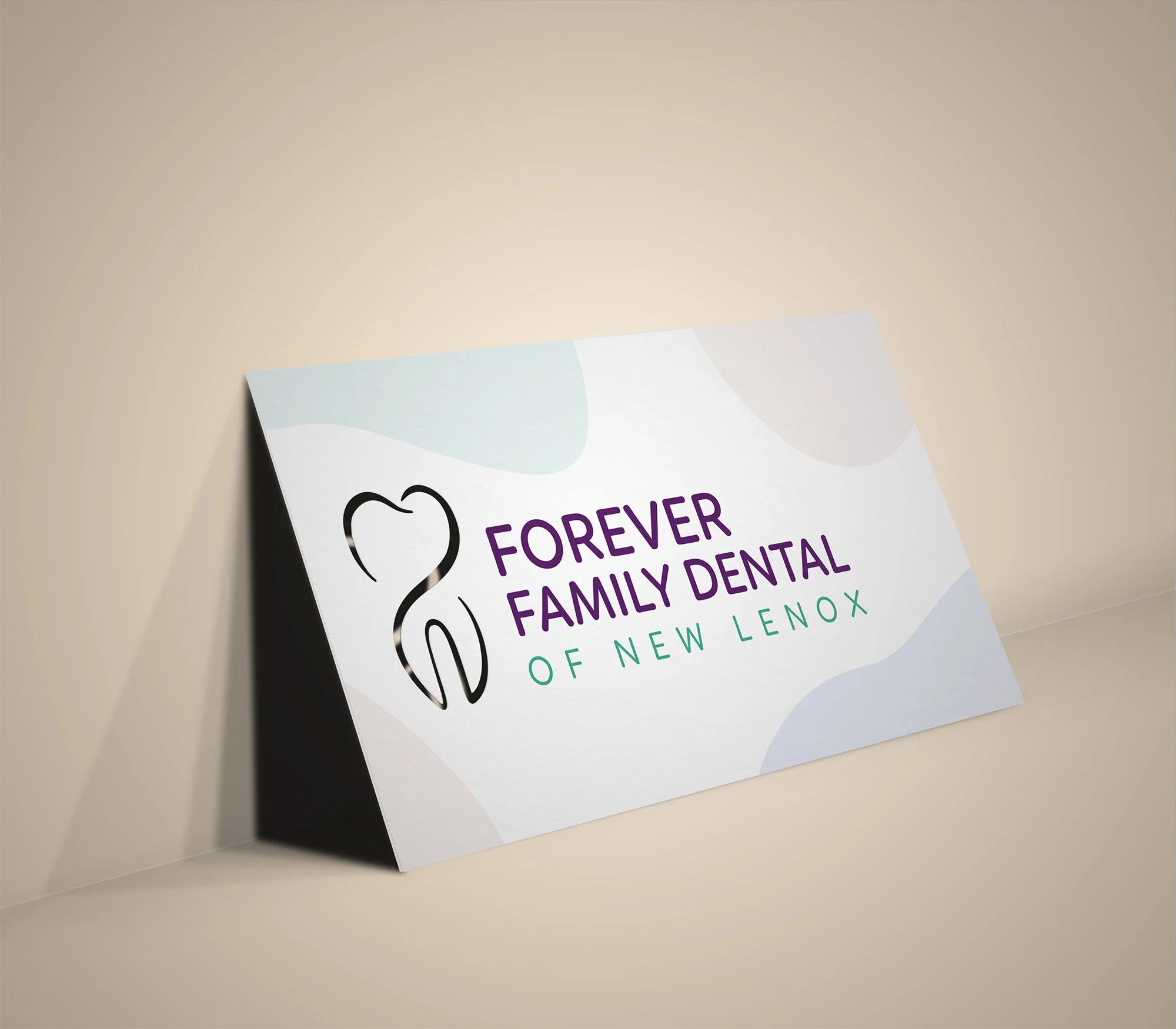
The creative solution brought together three interlocking symbols that visually expressed the practice’s philosophy. The infinity symbol represents the idea of “Forever,” conveying lasting relationships, trust, and continuity of care. The heart shape stands for “Family,” symbolizing compassion, connection, and warmth. Finally, the tooth icon anchors the design in the dental field, tying the concept together in a clean, modern composition. Each element was deliberately merged into one seamless form to create a unified and memorable mark.
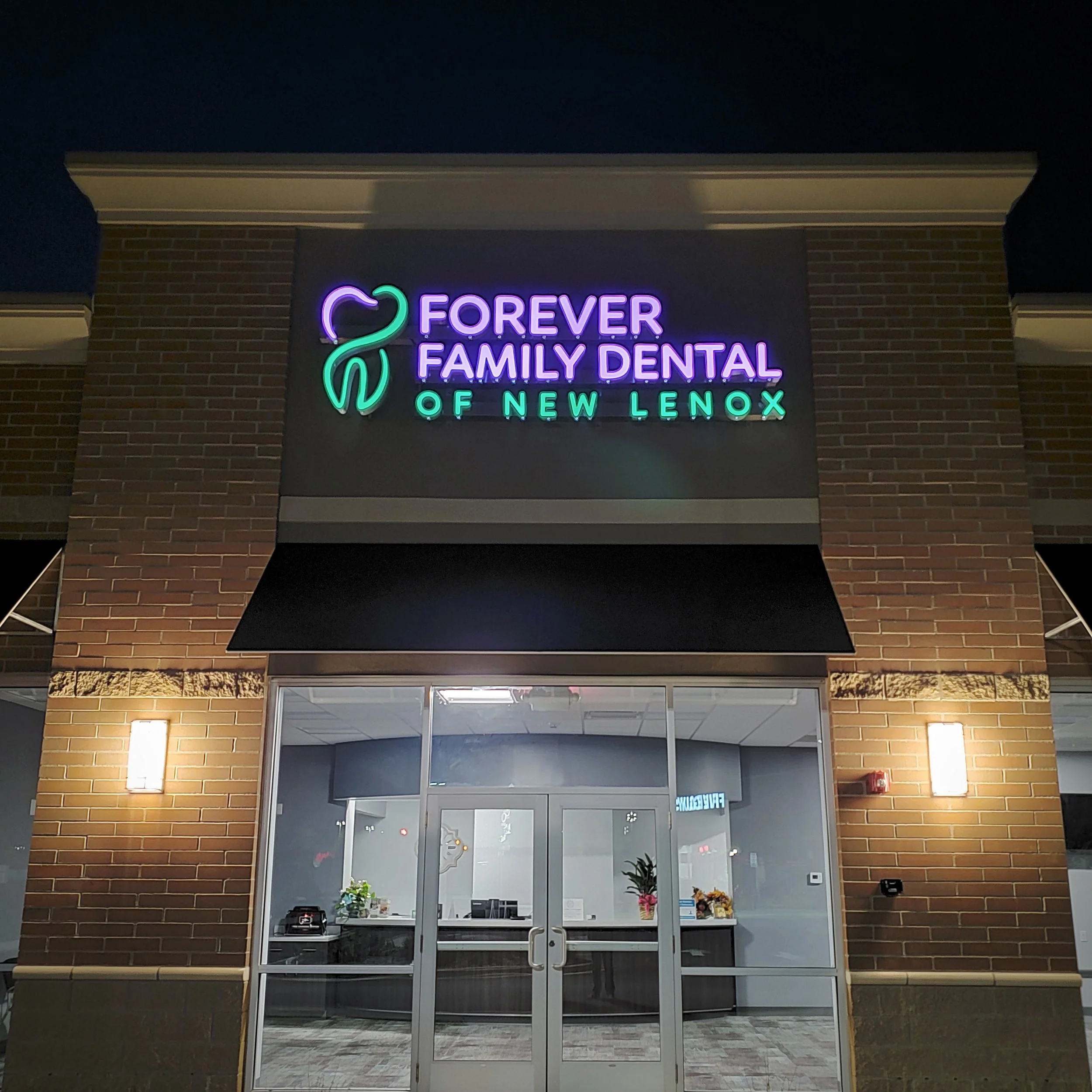


The color palette of vibrant purple and teal was chosen to reinforce a sense of calm professionalism and friendliness while maintaining a contemporary look. The clean lines and balanced geometry of the logo ensure versatility across digital, print, and environmental applications. The design extends effortlessly to signage, uniforms, and interior branding, providing consistency and cohesion at every patient touchpoint.
The result is a brand identity that perfectly reflects the values of Forever Family Dental: trust, care, and connection. The logo has become the cornerstone of the practice’s visual identity, bringing a sense of warmth and professionalism to everything from marketing materials to the clinic’s exterior signage. By blending thoughtful symbolism with modern simplicity, the design successfully communicates the heart of the practice and helps foster lasting relationships with patients.