ATypI Chicago Conference Branding & Identity
Serif-ously in love with type
Serif-ously in love with type

For this project, I developed the complete branding and identity system for a hypothetical ATypI (Association Typographique Internationale) Conference in Chicago, envisioned to take place at the Museum of Contemporary Art. The challenge was to craft a bold, modern, and typographically rich visual language that would both honor the discipline of typography and reflect Chicago’s industrial, architectural spirit.
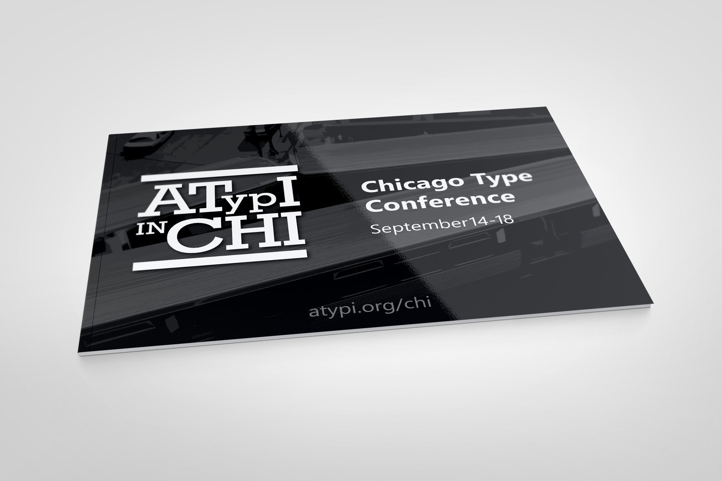
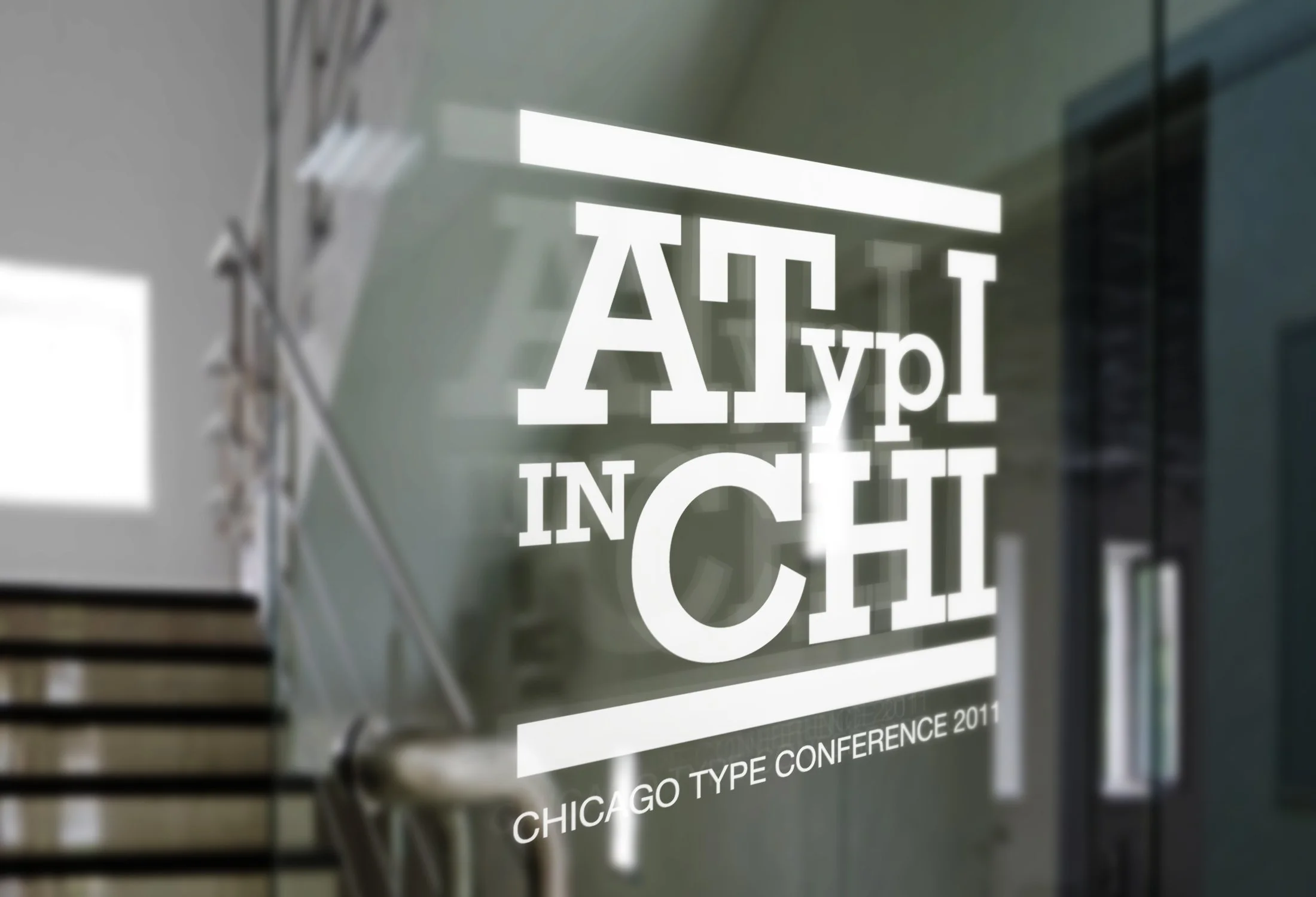
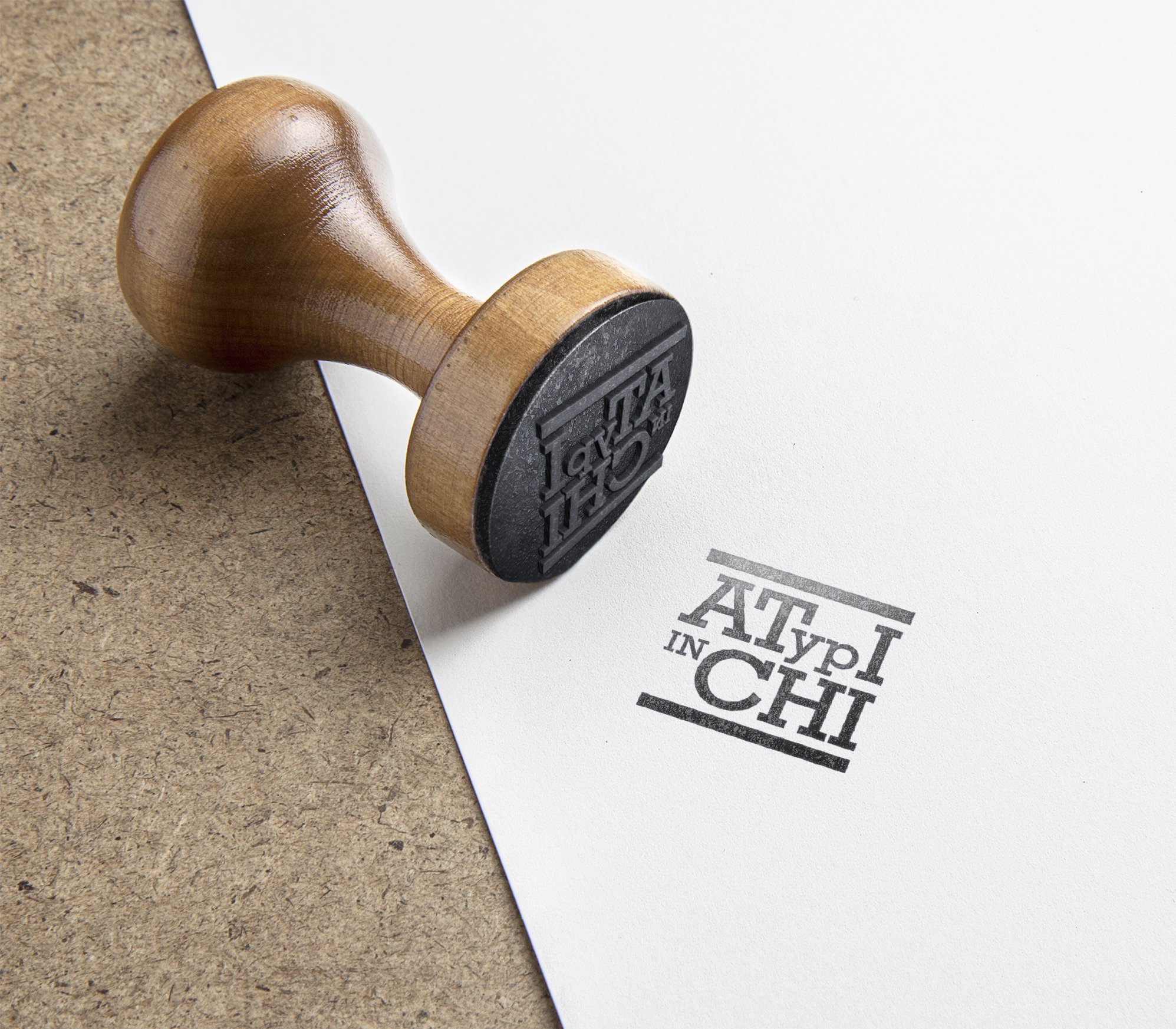
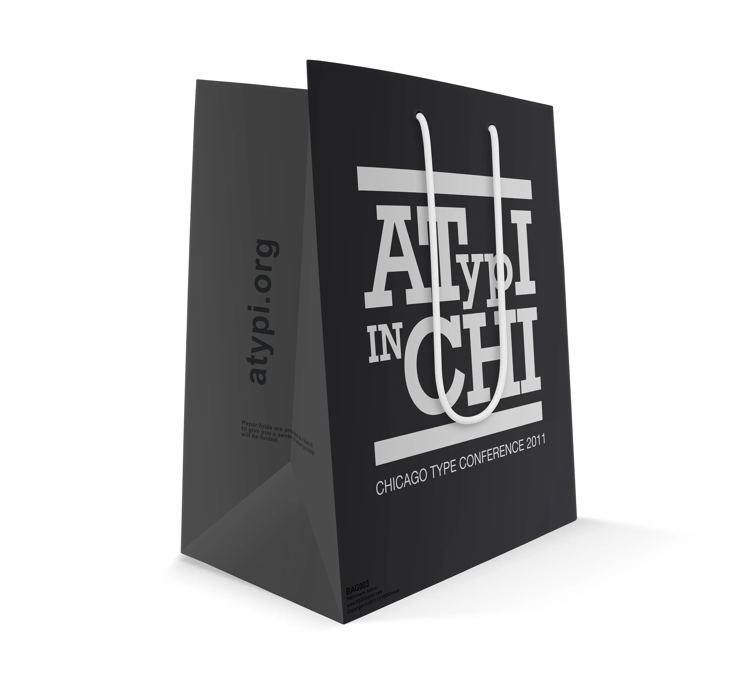
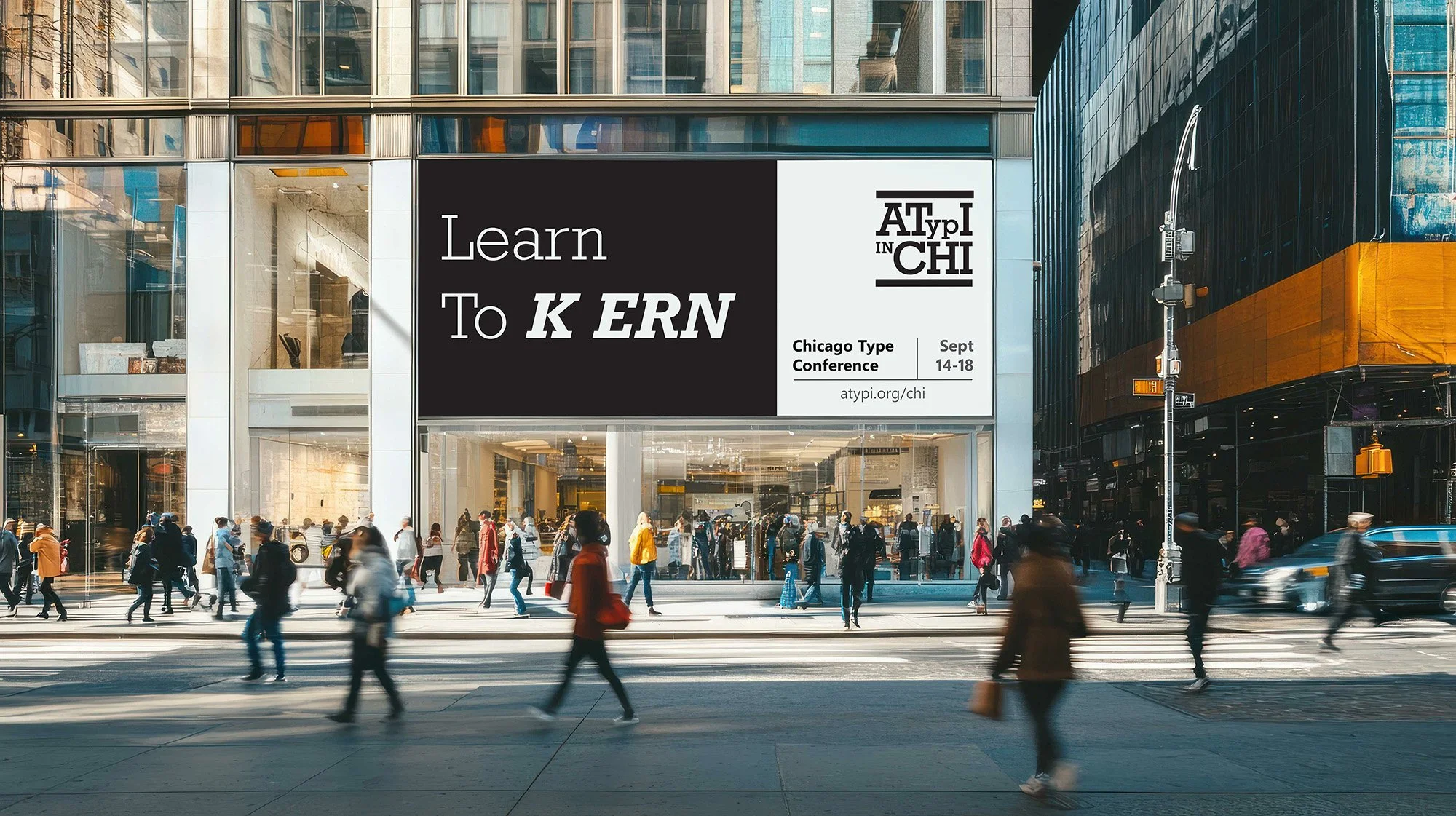
The creative foundation drew from Rockwell Slab Serif as the primary typeface, chosen for its weight, structure, and strong presence; qualities that aligned with Chicago’s reputation as the “City of Broad Shoulders.” A restrained black-and-white palette ensured that typography remained the hero, keeping the design both contemporary and minimal while highlighting the form and craft of letterforms. The logo, designed in the style of a stamp, emphasized tactile, nested letterforms that connected the physicality of print with the city’s industrial heritage.
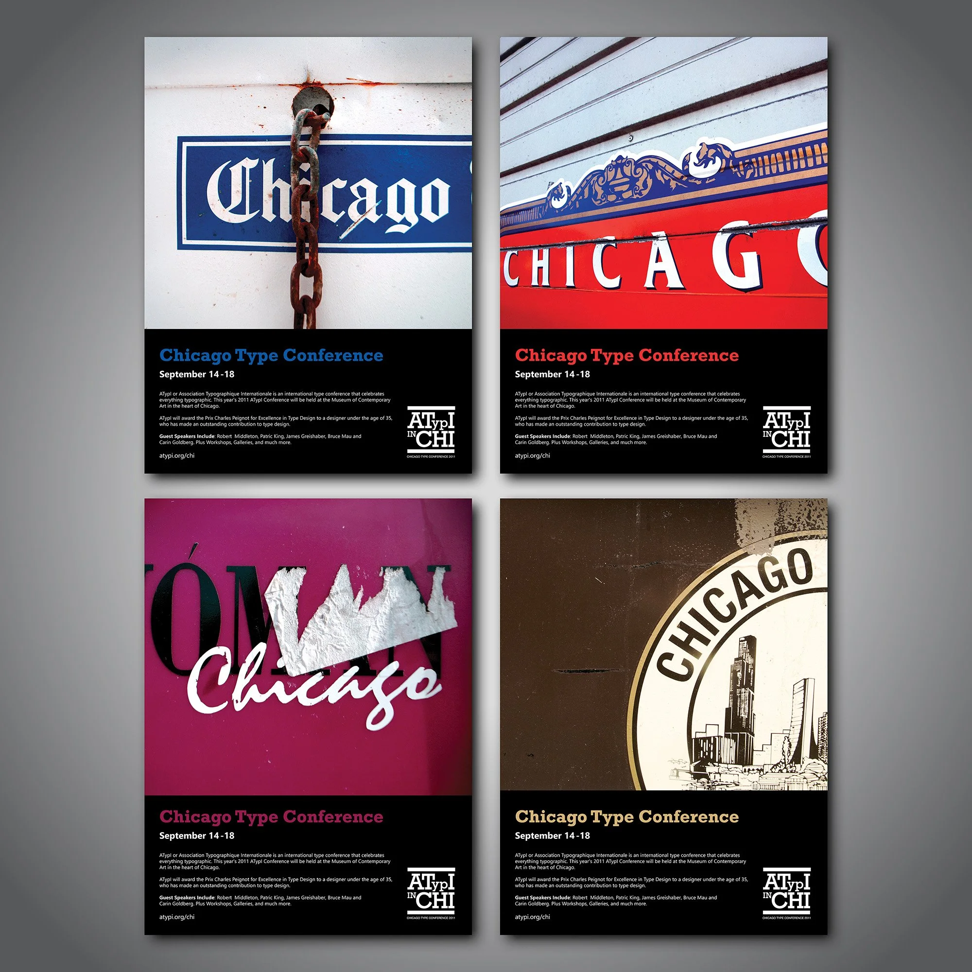
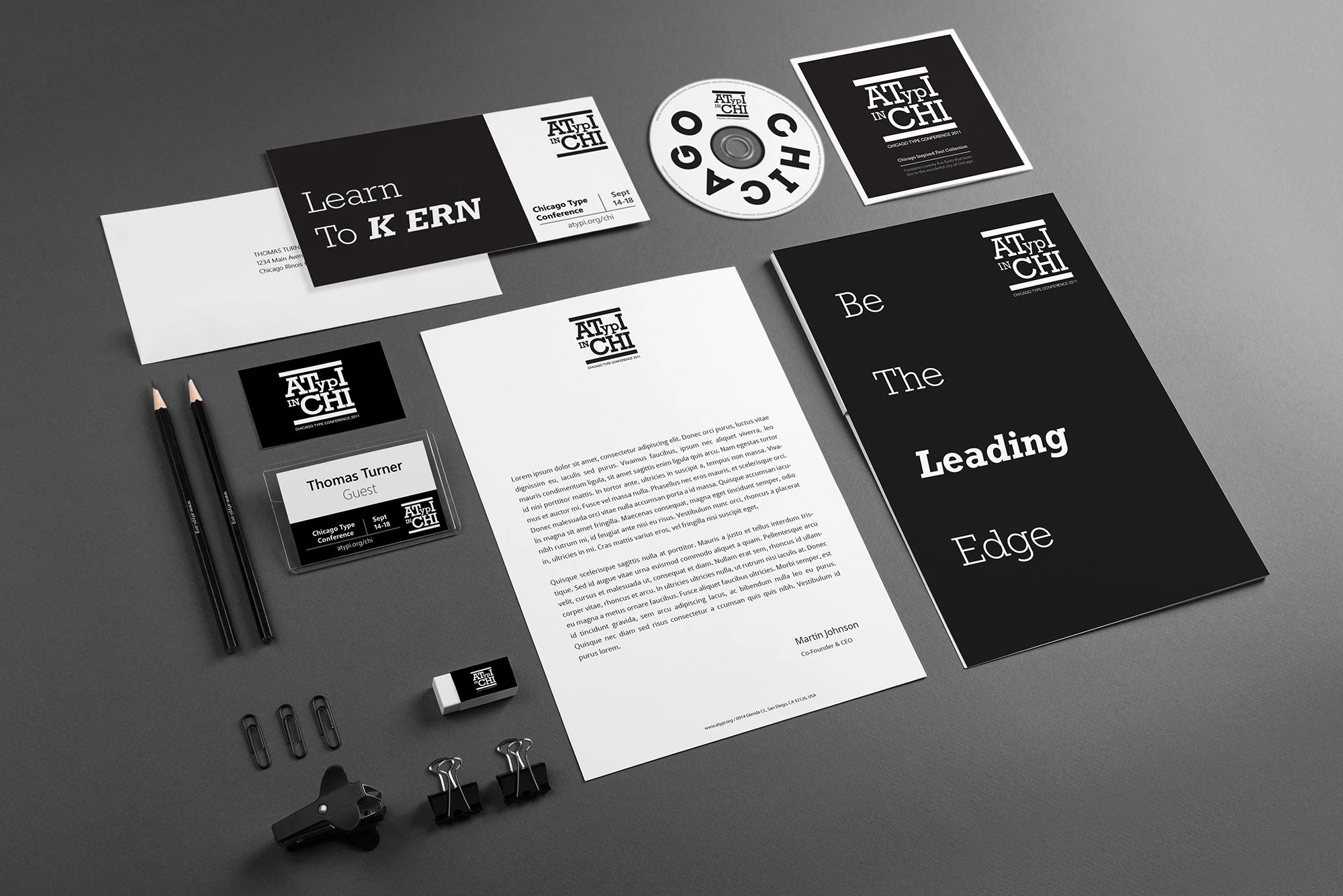
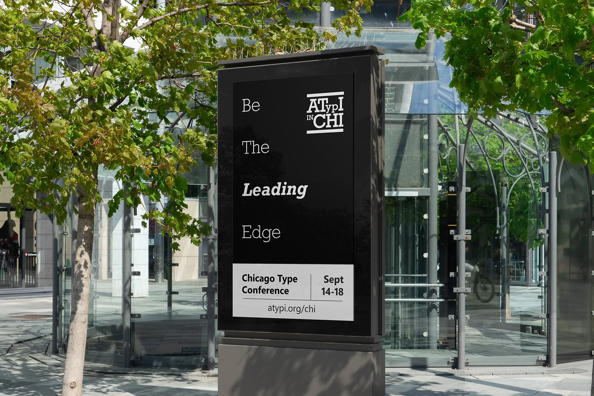
This identity extended across a full range of collateral, including posters, billboards, and venue signage, each featuring witty, typographically inspired messaging that engaged directly with the design community. Phrases such as “Learn to k ern” and “Be the leading edge” created moments of recognition and delight for type enthusiasts, transforming the branding into both a visual and intellectual experience.
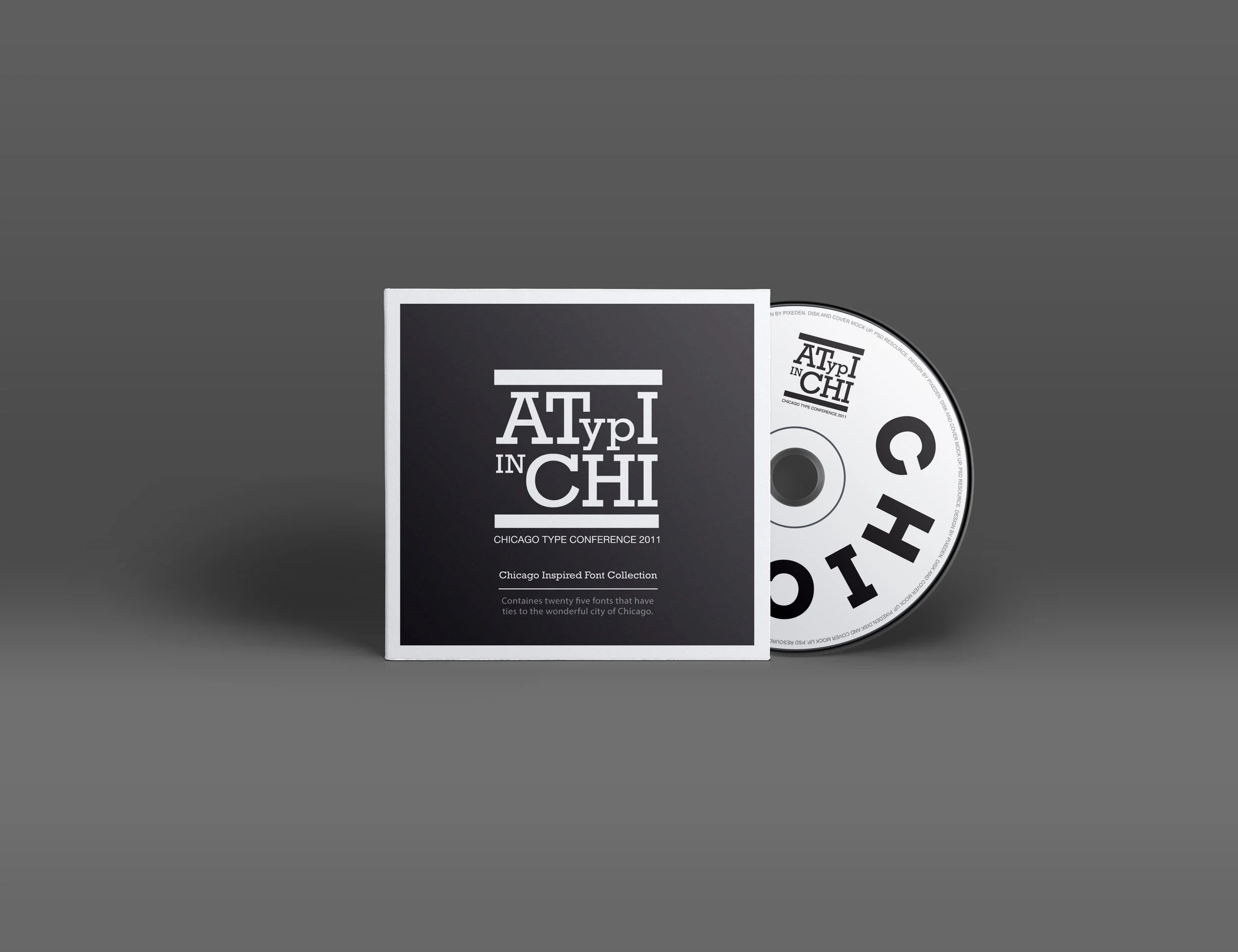
The conference experience was further enhanced through carefully designed attendee materials. Swag included a custom stamp with the logo, a branded conference bag containing a curated font compilation CD, a stationery set, and a printed agenda. Each element reinforced the tactile, celebratory nature of typography while unifying the attendee journey through design consistency.
Through the combination of bold typography, cohesive design systems, and playful industry-specific messaging, this project captured the spirit of ATypI while situating it firmly within Chicago’s cultural and industrial identity. The result was a visual experience that was as immersive as it was meaningful, celebrating the art and craft of type at every touchpoint.